Every business owner asks the same question at some point: what makes a great logo? It seems like a simple design element, just a small image that sits in the corner of a website or on a business card. But this small mark carries far more weight than most people realize. It is often the very first thing a potential customer sees, and first impressions are hard to undo.
A great logo does more than look nice. It communicates who you are, what you stand for, and why someone should trust you over a competitor. Get it right, and it becomes one of the most valuable assets your business owns. Get it wrong, and it can quietly undermine everything else you build, from your website to your marketing campaigns.
In this guide, we will break down exactly what makes a great logo, the core principles behind effective brand mark design, common mistakes businesses make, and how to approach the process the right way. Whether you are launching a new brand or rethinking an outdated one, this article will give you a clear, practical roadmap.
Why a Great Logo Matters More Than You Think
Before diving into design principles, it helps to understand why this small design element matters so much in the first place. A logo is not just decoration. It is a visual shorthand for your entire brand identity.
Think about brands like Nike, Apple, or McDonald's. You recognize their marks instantly, often without needing to see the company name at all. That instant recognition did not happen by accident. It came from careful design choices combined with consistent use over time.
For small and medium-sized businesses, a strong logo plays several important roles:
- It builds instant recognition across platforms, from your website to social media
- It signals professionalism and credibility to new customers
- It creates an emotional connection tied to your brand values
- It differentiates you from competitors in a crowded market
- It supports every other marketing effort you invest in
When a logo is designed thoughtfully, it becomes the anchor point for your entire visual identity. This is why many businesses choose to work with a professional Logo Design team rather than attempting a DIY approach or relying on generic templates.
The Core Principles of a Great Logo
So what actually separates a forgettable logo from a memorable one? After years of studying successful brands, designers generally agree on a handful of core principles. Let's go through each one.
1. Simplicity
The best logos in the world are often the simplest. Think of the Twitter bird, the Apple mark, or the Nike swoosh. None of these designs are complicated, yet all of them are instantly recognizable.
Simplicity matters because it makes a design easier to remember, easier to reproduce across different formats, and easier to scale down without losing clarity. A logo packed with intricate details might look impressive on a large screen, but it often becomes an unreadable blur when shrunk down to a favicon or a mobile app icon.
A good rule of thumb: if you cannot describe your design in one or two simple sentences, it might be too complicated.
2. Memorability
Your brand mark should stick in someone's mind after just a glance. This ties closely to simplicity, but it also involves having a distinctive element, whether that is a unique shape, an unusual color combination, or a clever use of negative space.
Memorable logos often use one of these techniques:
- A single bold shape or symbol
- A clever visual trick, like hidden imagery within negative space
- An unexpected color pairing that stands out from competitors
- A distinctive typography style that feels custom rather than generic
3. Versatility
Your brand mark will not just live on your website. It needs to work on business cards, social media profile pictures, merchandise, email signatures, packaging, and signage. Because of this, versatility is non-negotiable.
A truly great design works in the following contexts:
- Full color and black and white versions
- Large formats like billboards and small formats like app icons
- Light backgrounds and dark backgrounds
- Horizontal, vertical, and square layouts
If your design only looks good in one specific size or color scheme, it is going to create problems down the road, especially as your business expands into new marketing channels.
4. Relevance
A brand mark needs to reflect the industry and audience it is designed for. A children's toy company and a law firm should not have similar-looking marks, even if both are technically well-designed. The visual style, color palette, and typography all need to feel appropriate for the audience you are trying to reach.
This is where working with an experienced design team becomes valuable. It takes market awareness and design expertise to strike the right balance between creativity and relevance. A skilled designer understands how to translate your brand's personality into visuals that resonate with your specific customers.
5. Timelessness
Trends come and go, but a great logo should be built to last. Think about how long some of the most iconic brand marks have remained largely unchanged. Coca-Cola's script wordmark has stayed recognizable for over a century, with only minor refinements.
Chasing trendy design styles might feel exciting in the short term, but it often leads to a mark that feels dated within just a few years. Instead, focus on timeless design principles: clean lines, balanced proportions, and colors that reflect your brand rather than whatever is currently popular on design blogs.
Color Psychology and Logo Design
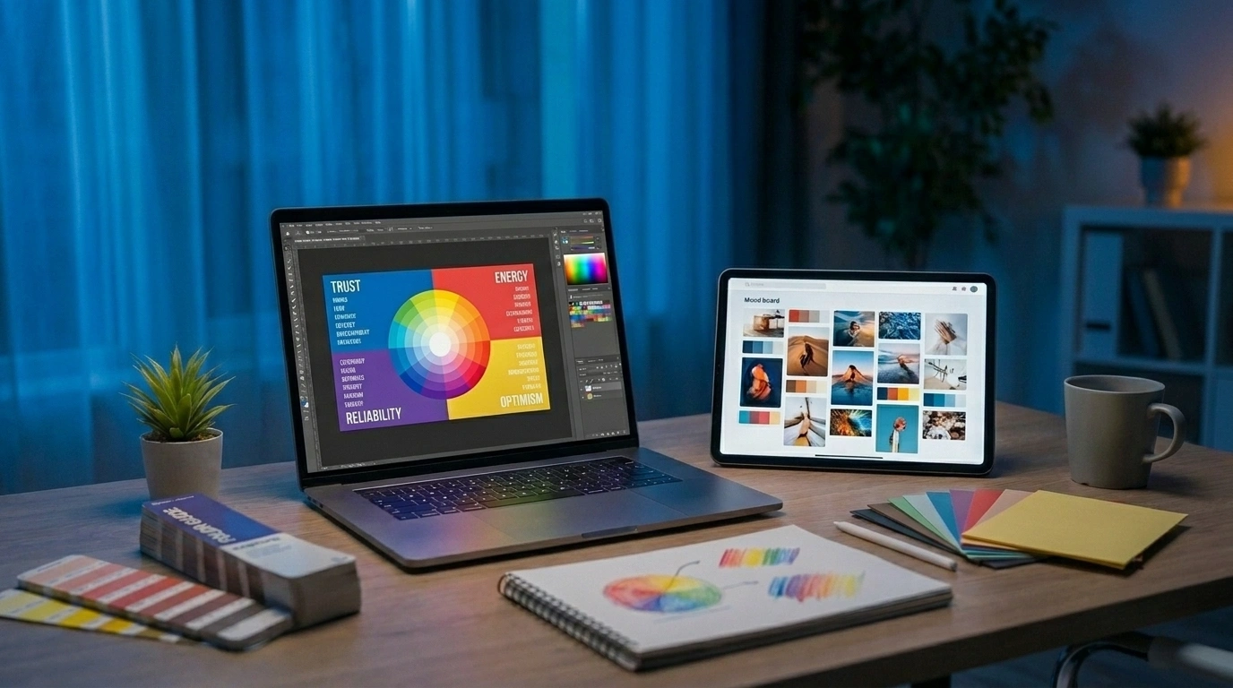
Color plays an enormous role in how people perceive a brand. Research from the American Psychological Association suggests that color can trigger measurable emotional responses, and smart brands use this to their advantage.
Here is a general breakdown of common color associations:
- Blue: trust, professionalism, calmness (commonly used by banks and tech companies)
- Red: energy, urgency, passion (often used in food and entertainment industries)
- Green: growth, health, sustainability (popular in wellness and environmental brands)
- Black: luxury, sophistication, authority (frequently used by high-end brands)
- Yellow: optimism, warmth, friendliness (often used to grab attention quickly)
Of course, color psychology is not an exact science, and cultural context matters too. A color that feels positive in one region might carry a different connotation elsewhere. This is why choosing the right palette requires more than a quick guess. It benefits from research, testing, and a solid understanding of your target market.
Color is also one piece of a much larger puzzle. Your design's color scheme should align with your broader visual identity, including your website, packaging, and marketing materials. Businesses that invest in comprehensive Branding & Advertising strategies tend to build far more consistent and recognizable brand experiences across every touchpoint.
Typography: The Often Overlooked Element
While shapes and colors get most of the attention, typography deserves just as much consideration. The font used in a brand mark says a lot about a company's personality, sometimes even more than the image itself.
Here are a few typography styles and what they typically communicate:
- Serif fonts (with small decorative strokes) often feel traditional, trustworthy, and established. Many law firms, universities, and financial institutions use serif typography.
- Sans-serif fonts (clean, without decorative strokes) feel modern, minimal, and approachable. Tech companies and startups frequently lean toward this style.
- Script fonts feel elegant, personal, and creative, often used by boutique brands or businesses in the beauty and hospitality space.
- Bold, geometric fonts convey confidence and strength, often seen in sports brands and fitness companies.
Choosing the right typography requires balancing legibility with personality. A font that looks beautiful but is hard to read defeats the purpose of the mark, which is ultimately about clear communication.
Common Logo Design Mistakes to Avoid
Even well-intentioned businesses make mistakes when designing or commissioning a new brand mark. Here are some of the most frequent issues we see.
Overcomplicating the Design
As mentioned earlier, simplicity wins. Business owners sometimes want to cram every service they offer into the design itself. This almost always backfires, resulting in a cluttered mark that fails to communicate anything clearly.
Following Trends Too Closely
Gradient effects, 3D shading, and other trendy design techniques might look appealing today, but they can quickly make a mark feel outdated. A logo is a long-term investment, not a seasonal fashion choice.
Ignoring Scalability
A design that looks great on a website banner but turns into a muddy mess when shrunk to a social media profile picture is a serious problem. Every brand mark should be tested across multiple sizes and formats before finalizing the design.
Copying Competitors
It can be tempting to look at a successful competitor and create something similar. However, this approach undermines the very thing a brand mark is supposed to achieve: differentiation. Customers need to be able to tell your business apart at a glance.
Skipping Professional Input
DIY logo generators have become popular, and while they are fine for very early testing, they often produce generic results that thousands of other businesses are also using. A brand mark is one of the few visual elements that genuinely benefits from professional design expertise, careful strategy, and an understanding of your specific market.
How a Great Logo Fits Into Your Broader Brand Strategy
A brand mark does not exist in isolation. It works best as part of a cohesive identity system that includes your website design, marketing materials, packaging, and even your social media presence.
For example, imagine a local bakery investing in a beautifully designed logo, but their website looks outdated, their social media graphics are inconsistent, and their marketing messaging feels disconnected. The design alone will not save the overall brand experience. Customers notice these inconsistencies, even if only on a subconscious level.
This is why businesses often see the best results when brand mark creation, web development, and digital marketing are approached together as one connected strategy. A well-designed website, for instance, should visually echo the colors, fonts, and personality established in the logo. The same applies to social media content, email campaigns, and even physical signage.
At Razen Creations LLC, we approach logo design as the starting point of a larger brand journey, not a standalone task. Our team works closely with businesses to make sure the visual identity, website, and marketing materials all speak the same language.
Practical Business Scenarios Where Logo Design Makes a Real Difference
Let's look at a few real-world scenarios where getting the visual identity right (or wrong) genuinely impacts business outcomes.
Scenario 1: A New Startup Launching Its First Website
A tech startup preparing to launch needs more than just a strong mark. It needs a cohesive digital presence. Pairing a strong logo with professional Web Design & Development ensures the brand feels polished and trustworthy from day one, which matters enormously when trying to win over early customers or investors.
Scenario 2: A Retail Brand Expanding Into E-Commerce
A retail business moving into online sales needs a brand mark that works seamlessly across a website, product packaging, and social media ads. Combined with strong UI/UX design, it becomes part of a shopping experience that feels consistent and professional, building the kind of trust that turns browsers into buyers.
Scenario 3: A Local Service Business Growing Its Online Presence
A local service provider, such as a contractor or clinic, benefits enormously from a memorable logo paired with consistent Social Media Graphics. When every post, story, and profile picture reflects the same visual identity, customers build familiarity and trust over time, which directly supports referrals and repeat business.
Scenario 4: An Author Publishing Their First eBook
Even authors benefit from strong branding. A recognizable personal logo or brand mark, combined with professional eBook publishing support, helps build an author's identity as they release multiple titles over time, creating a consistent presence across platforms like Amazon and beyond.
Scenario 5: A Growing Company Needing Custom Software
As businesses scale, they often need custom software solutions such as internal dashboards, client portals, or mobile apps. Even software interfaces benefit from consistent branding. A brand mark and color scheme applied thoughtfully across a custom software product reinforces trust and makes the tool feel like a natural extension of the company, rather than something bolted on separately.
These scenarios all point to the same conclusion: a brand mark works best when it is part of a bigger, well-coordinated strategy.
The Logo Design Process: What to Expect
If you are considering a new brand mark or a rebrand, it helps to understand what a professional design process typically looks like. While every agency approaches things slightly differently, here is a general outline.
- Discovery and Research: Understanding your business, target audience, competitors, and brand values before any design work begins.
- Concept Development: Creating multiple initial concepts based on the research phase, exploring different directions in terms of style, color, and typography.
- Refinement: Narrowing down to one or two strong concepts and refining details like spacing, proportions, and color balance.
- Testing Across Formats: Making sure the chosen design works across various sizes, backgrounds, and applications.
- Finalization and Delivery: Providing final files in multiple formats (vector, PNG, JPEG) along with brand guidelines for consistent future use.
Skipping steps in this process, particularly the research phase, often leads to a design that looks fine on the surface but fails to genuinely represent the brand or resonate with its intended audience.
Why Businesses Choose to Work With Professionals
It is entirely possible to attempt a design on your own, and for some very early-stage side projects, that might be a reasonable starting point. But for businesses serious about building a lasting brand, working with experienced designers offers real advantages.
Professional designers bring:
- An understanding of design theory, including color psychology and typography
- Experience across many industries, allowing for smarter, more strategic decisions
- The ability to create a full suite of files and formats for every use case
- A collaborative process that incorporates feedback while staying true to sound design principles
- Long-term thinking, ensuring the design will still feel relevant years down the road
If you are ready to invest in a logo that truly represents your business, our team is here to help. Work with Razen Creations LLC to create a brand mark that reflects your company's personality and stands the test of time.
Final Thoughts
So, what makes a great logo? At its core, it comes down to simplicity, memorability, versatility, relevance, and timelessness. A great logo is not just a pretty picture. It is a strategic tool that builds recognition, trust, and emotional connection with your audience over time.
Businesses that treat their brand mark as part of a bigger strategy, one that includes web design, digital marketing, and consistent visual identity across every channel, tend to see far stronger results than those who treat it as an isolated task.
If your current logo feels outdated, inconsistent, or simply is not working as hard as it should, now might be the right time for a change. Get a free consultation with our team and let's talk about how the right design can support your business goals.
Frequently Asked Questions
1. What makes a great logo different from an average one?
A great logo is simple, memorable, and versatile enough to work across every platform your business uses. An average logo might look fine in one context but fail when scaled down, printed in black and white, or placed on a busy background. The difference often comes down to thoughtful design decisions made early in the process.
2. How much does professional logo design typically cost?
Costs vary depending on the scope of the project, the experience of the design team, and how many revisions or file formats are included. A simple logo package will cost less than a comprehensive branding package that includes style guides and multiple asset types. It is best to request a personalized quote based on your specific needs.
3. How long does it take to design a logo?
The timeline depends on the complexity of the project and how many rounds of revisions are needed. A straightforward logo project might take a couple of weeks, while a more involved branding project, especially one paired with a broader identity system, can take longer.
4. Can I update or redesign my logo without confusing existing customers?
Yes, many well-known brands refresh their logos periodically. The key is to make thoughtful, gradual updates rather than a complete overhaul that abandons everything customers already recognize. A good design partner can help you strike this balance carefully.
5. Do I need a different logo for social media versus my website?
Not necessarily a different logo, but you likely need different formats and croppings of the same logo. Social media platforms often require square or circular formats, while your website might use a horizontal version. Consistency in color and style across all these formats matters more than having entirely separate designs.
6. What file formats should I receive after a logo is designed?
At minimum, you should receive vector files (such as AI or EPS) for scalability, along with PNG files with transparent backgrounds and JPEG files for general use. Vector files are especially important because they allow your logo to be resized without losing quality.
7. Should my logo design be connected to my overall marketing strategy?
Absolutely. A logo works best when it is part of a larger, cohesive brand identity that carries through your website, social media graphics, and marketing campaigns. Treating your logo as one piece of a bigger strategy, rather than an isolated task, leads to stronger brand recognition over time.
Ready to build a logo and brand identity that truly represents your business? Contact our team at Razen Creations LLC today.