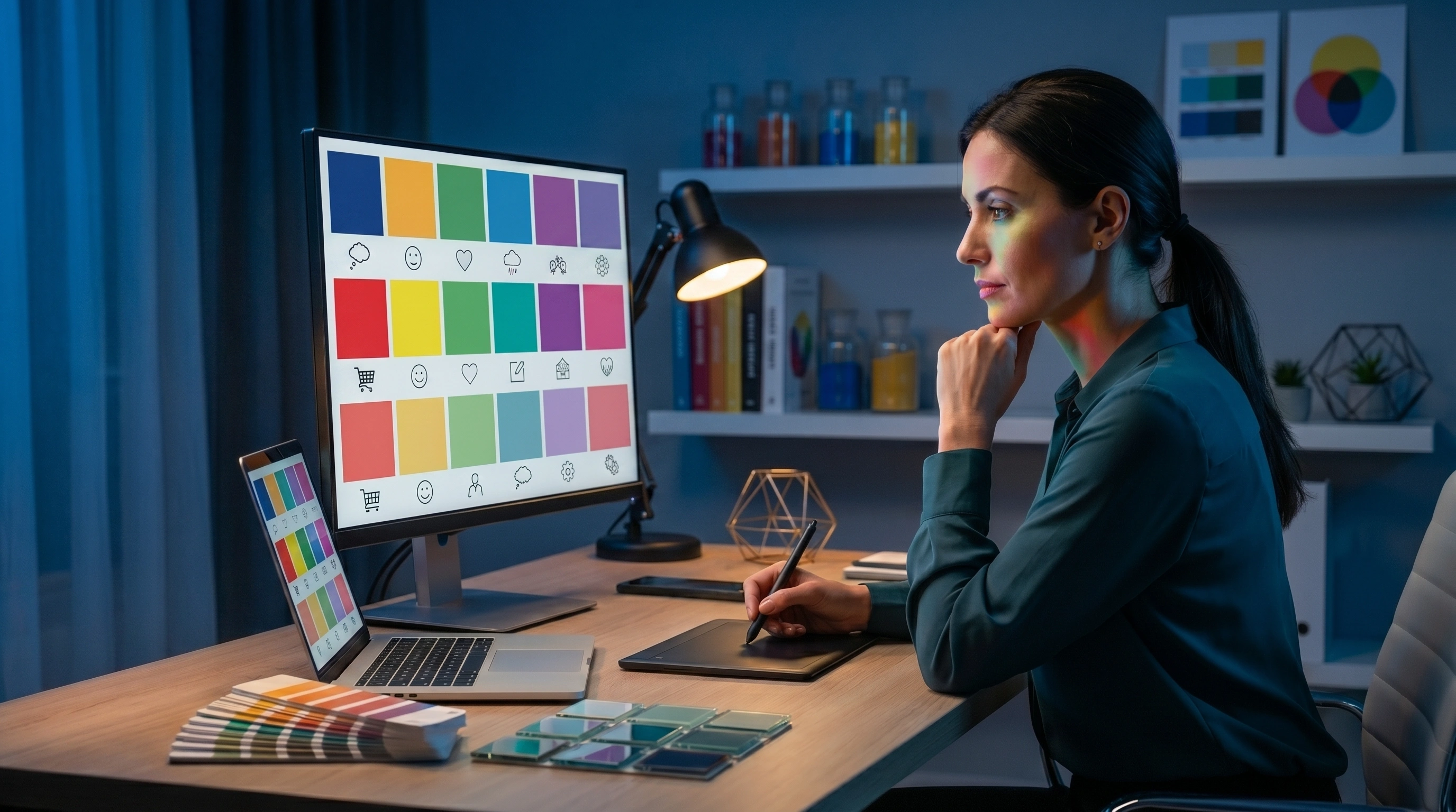


Color psychology in design is the study of how colors influence emotions, decisions, and behavior. The right colors can build trust, spark action, and shape how people feel about your brand. Used well, color psychology in design helps businesses boost conversions, strengthen branding, and create a memorable customer experience.
Color is one of the first things a customer notices about your brand. Before they read a single word, the colors on your website, logo, or app have already started shaping how they feel. That first impression happens in seconds, and it sticks.
This is why color psychology in design matters so much for businesses. It is not just about picking shades that look pretty. It is about understanding how those colors affect emotions, build trust, and guide buying decisions. When you get it right, color becomes a quiet but powerful sales tool.
In this guide, we will break down what color psychology in design really means, how individual colors influence customers, and how you can apply these ideas to your website, branding, and marketing. Let's get into it.
What Is Color Psychology in Design?
Color psychology in design is the study of how colors affect human emotions and behavior. It looks at the way certain shades make people feel calm, excited, confident, or cautious, and how those feelings shape the choices they make.
Think about how a fast-food brand uses bright red and yellow, or how a bank leans on deep blue. These choices are rarely random. They are based on years of research into how people respond to color.
Here is what makes color psychology so useful for businesses:
- It works fast. People form opinions about products within 90 seconds, and a large share of that judgment is based on color alone.
- It shapes emotion. Colors trigger feelings before logic kicks in.
- It guides action. A well-chosen button color can lift clicks and sales.
- It builds recognition. Consistent colors make your brand easier to remember.
According to research shared by HubSpot, color can improve brand recognition significantly, which directly supports trust and sales. That is the real power of color psychology in design. It connects how something looks with how people behave.
Why Color Psychology in Design Matters for Your Business
Color is not decoration. It is communication. Every shade sends a message, whether you plan it or not. When your colors match your brand message, everything feels aligned. When they clash, customers feel confused even if they cannot say why.
Strong use of color psychology in design helps you:
- Create a clear and consistent brand identity
- Build trust with new visitors
- Improve how easy your website is to use
- Increase clicks, signups, and purchases
- Stand out from competitors in a crowded market
A poorly chosen color scheme can quietly cost you customers. A smart one can do the opposite. This is where thoughtful design makes a measurable difference to your bottom line.
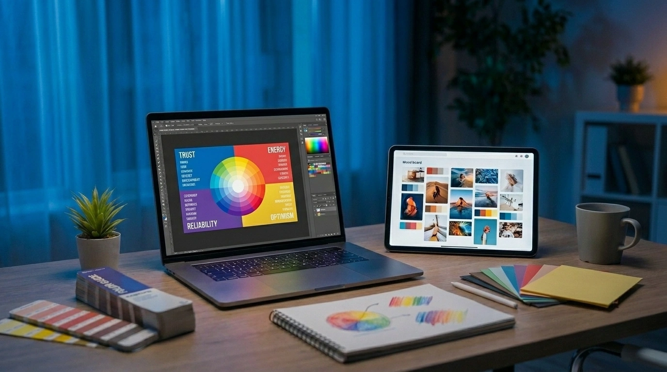
How Specific Colors Affect Customer Emotions and Buying Decisions
Each color carries its own meaning and emotional weight. Let's look at the most common colors used in branding and design, and what they do to customer behavior.
Red: Energy, Urgency, and Action
Red is bold and impossible to ignore. It raises energy and creates a sense of urgency, which is why it works so well for sales and calls to action.
Red tends to:
- Grab attention quickly
- Stir excitement and passion
- Encourage fast decisions
- Increase appetite (a favorite for food brands)
You will often see red on "Buy Now" buttons, clearance sales, and limited-time offers. It pushes people to act. Just use it carefully, since too much red can feel aggressive or stressful.
Best for: Sales promotions, food and drink brands, entertainment, and bold calls to action.
Blue: Trust, Calm, and Reliability
Blue is the most trusted color in branding, and for good reason. It feels calm, stable, and dependable. That is why banks, tech companies, and healthcare brands rely on it so heavily.
Blue tends to:
- Build trust and confidence
- Create a sense of calm
- Suggest professionalism and security
- Reduce feelings of stress
If your business depends on credibility, blue is a safe and smart choice. It tells customers, "You can rely on us." This makes it a strong base color for many websites and apps.
Best for: Finance, technology, healthcare, and any brand built on trust.
Green: Growth, Health, and Balance
Green connects to nature, health, and money. It feels fresh and balanced, which makes it popular with wellness brands, eco-friendly companies, and financial services.
Green tends to:
- Suggest health and freshness
- Create a calm, balanced feeling
- Signal growth and prosperity
- Reassure environmentally minded buyers
Green is also easy on the eyes, which makes it great for designs that need a relaxed, welcoming tone. It pairs well with clean, modern layouts.
Best for: Health and wellness, eco brands, finance, and organic products.
Yellow: Optimism, Warmth, and Attention
Yellow is the color of sunshine and happiness. It feels warm, friendly, and energetic. Used in the right spots, it grabs attention without the intensity of red.
Yellow tends to:
- Spark optimism and cheer
- Draw the eye to key areas
- Feel approachable and friendly
- Create warmth and energy
The catch is that too much yellow can strain the eyes or feel overwhelming. It works best as an accent color rather than a background.
Best for: Brands that want to feel cheerful, playful, or youthful.
Black: Luxury, Power, and Sophistication
Black is sleek, bold, and timeless. It signals luxury, power, and elegance, which is why high-end brands use it so often. A black design feels confident and premium.
Black tends to:
- Suggest luxury and exclusivity
- Convey strength and authority
- Create a modern, sophisticated look
- Make other colors pop when used together
Used well, black adds class to a design. Used poorly, it can feel heavy or cold. Balance is key, often by pairing it with plenty of white space.
Best for: Luxury goods, fashion, premium tech, and high-end services.
White: Simplicity, Cleanliness, and Space
White is clean, simple, and open. It gives a design room to breathe and helps other elements stand out. Many modern brands use white space to create a calm, focused experience.
White tends to:
- Suggest cleanliness and purity
- Create a sense of space and clarity
- Make content easier to read
- Support a minimal, modern look
White is rarely used alone, but it plays a huge role in good design. It is the quiet partner that makes every other color shine.
Best for: Minimalist brands, healthcare, technology, and clean modern layouts.
How to Apply Color Psychology in Design for Your Business
Knowing what colors mean is only half the work. The real value comes from applying color psychology in design across your website, branding, and marketing in a smart, consistent way.
1. Start With Your Brand Personality
Before choosing colors, define how you want your brand to feel. Ask yourself:
- Do we want to feel trustworthy and calm, or bold and exciting?
- Are we premium and luxurious, or friendly and approachable?
- Who is our ideal customer, and what appeals to them?
Your answers point you toward the right palette. A children's brand and a law firm should never share the same colors, because they speak to very different emotions.
2. Use Color to Guide Customer Actions
Color can lead the eye and encourage action. This is especially important for buttons, links, and calls to action.
Here are a few practical tips:
- Make your main call-to-action button a color that stands out from the rest of the page
- Use contrast to highlight important areas like pricing or signup forms
- Keep less important elements in softer, neutral tones
- Test different button colors to see which one drives more clicks
Thoughtful color choices in your UI/UX design can directly improve how users move through your site and how often they convert.
3. Keep Colors Consistent Across Every Touchpoint
Consistency builds recognition. Your website, app, social media, and packaging should all use the same core colors. When customers see the same palette everywhere, your brand feels more professional and trustworthy.
A few ways to stay consistent:
- Create a simple brand style guide with your main colors
- Use the same color codes across all platforms
- Limit your palette to two or three core colors plus accents
- Apply colors the same way every time, for example always using one shade for buttons
4. Match Colors to Your Audience and Culture
Color meanings can shift across cultures and age groups. White means purity in some cultures and mourning in others. Younger audiences may respond to bold, vibrant palettes, while older audiences often prefer calmer tones.
Always think about who you are designing for. The goal is to choose colors that connect with your specific customers, not just colors you personally like. Research from sources like Forbes shows that emotional connection plays a major role in customer loyalty, and color is a big part of that connection.
5. Test, Measure, and Improve
Color psychology gives you a strong starting point, but real data tells you what works for your audience. Run simple tests to compare different choices.
You can test:
- Button colors on your checkout or signup page
- Background colors for key landing pages
- Color combinations in email campaigns
- Accent colors used in ads and social posts
Small changes can lead to surprising results. The brands that win treat color as something to refine over time, not set once and forget.
How Razen Creations LLC Helps You Use Color Psychology in Design
Getting color right takes both creativity and strategy. That is where Razen Creations LLC comes in. We help businesses turn color psychology in design into real results through smart, research-backed design choices.
Here is how our team supports your brand:
- UI/UX Design: We design interfaces that use color to guide users, reduce friction, and increase conversions. Every shade has a purpose.
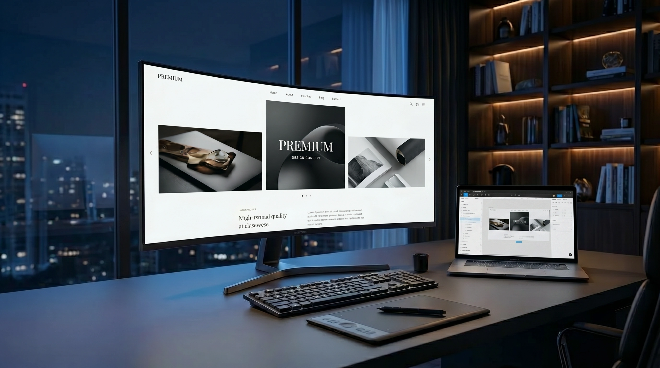
- Web Design and Development: Our web design and development services bring your color strategy to life with fast, attractive, and conversion-focused websites.
- Branding: We build cohesive brand identities, including color palettes that match your message and connect with your audience.
We do not pick colors at random. We base every choice on your goals, your audience, and proven design principles. The result is a brand that looks great and performs even better.
Ready to make your brand stand out with the right colors? Get a free consultation with our team and see what thoughtful design can do for your business. Work with Razen Creations LLC and build a digital presence that truly connects.
Final Thoughts on Color Psychology in Design
Color is far more than a style choice. It shapes emotions, builds trust, and influences the decisions your customers make every day. When you understand color psychology in design, you gain a real advantage in how you attract and keep customers.
Start by defining your brand personality. Choose colors that match the feelings you want to create. Stay consistent across every platform, keep your audience in mind, and test your choices to see what works best.
The brands that master color do not just look good. They feel right to their customers, and that feeling drives loyalty and sales. With the right strategy and the right partner, you can do the same.
Frequently Asked Questions
What is color psychology in design?
Color psychology in design is the study of how colors affect human emotions and behavior. It helps businesses choose colors that build trust, guide actions, and shape how customers feel about a brand. The goal is to use color in a way that supports both your message and your sales.
Which color is best for a business website?
There is no single best color, since it depends on your brand and audience. Blue works well for trust and professionalism, green suits health and finance, and red drives urgency and action. The right choice matches your brand personality and the emotions you want to create.
Can color really affect sales and conversions?
Yes. Color influences how people feel and act, often within seconds. A clear, contrasting call-to-action button can increase clicks, and a trustworthy palette can encourage purchases. Many businesses see real improvements after refining their color choices through testing.
How many colors should a brand use?
Most strong brands stick to two or three core colors plus a few accent shades. This keeps your design clean, consistent, and easy to recognize. Too many colors can feel chaotic and weaken your brand identity.
Does color meaning change across cultures?
Yes. Colors can carry different meanings in different cultures and age groups. For example, white suggests purity in some places and mourning in others. Always consider who your customers are and where they are located before finalizing your palette.
How do I choose the right colors for my brand?
Start by defining your brand personality and your ideal customer. Then pick colors that match the emotions you want to create. It also helps to study competitors, test different options, and work with a design team that understands color psychology.
How can Razen Creations LLC help with color and design?
Razen Creations LLC offers UI/UX design, web design and development, and branding services. We use color psychology to create designs that look great and drive results. Contact our team for a free consultation and let's build a brand that connects with your customers.